

Project Name
Detail
About the Class
Believe & Acheive
Team Project
2017
Believe & Achieve was a team project for Interaction Design 3(UX research) class. Focused on user research and developing thinking process to find a right problem for the target and finding the solution for that problem.

OUR CHALLENGE
How can we use an OTT(Over-the-Top) platform to solve the problem for low-income Americans?
WHAT IS B&A
B&A(Believe & Achieve) is an organization that aims to inspire and encourage low-income individuals to get trained and be employed with higher and more satisfying income.
WHY WE DO THIS
We want to find a real problem that low-income people
are actually facing in their lives and find the solution for them.
TARGET AUDIENCE
Americans earning less than living wage
Americans who earned minimum wage or less
EARLY PROBLEM STATEMENT
A lot of Americans with minimum wage aren't making enough money for living and have very limited job opportunities because of lack of education(degree).
EARLY MISSION STATEMENT
To ensure every worker earns at least living wage by giving them tangible opportunities to network and learn.
INTERVIEW INSIGHTS
Visiting several different places to meet people who fit into our target audience and doing interviews with them.
Some places refused to do interviews, but some places were really opened up to us and told us about what they think.
Interviews were conducted with employees as well as employers.
OUR PIVOT
WHY B&A
Why low-income people need B&A?
Why B&A is different from other skill education institutes?
BUSINESS MODEL
- B&A provides free training service and tests to the customers(learners).
- Since B&A is a start-up and doesn't have enough budget, have partnership with WorkSource to open the test.
- Customers have to pass the test and get hired by B&A.
- B&A is subcontracted by companies and they offer full-time job to employees(B&A customers).
- B&A gets paid from companies, B&A takes certain percentage of the payment and customers get paid by B&A
USER KEY PATH
INTERFACE DEVELOPMENT (wireframes)
Doing several times of user testing, developed wireframes for B&A website and mobile app.
*
For the last mid-fidelity wireframes, color and visual elements were applied. However, through user testings, the results were that visual elements and colors are catching user's eyes and leading them what to see. After, we realized that we shouldn't be hurry to start visual designing, so we went back to greyscale.
MOBILE WIREFRMAES
Mobile app is more for B&A members who already have membership. More personal informations.
VISUAL DESIGN DIRECTION (SUGGESTION)
After the greyscale wireframes, I worked on what can be the visual direction for the next step. These days, visual effects like animated effects are very important, how we can use those visual effects and make it interactive is important especially for a lot of interface design. However, our target research shows that for a lot of these low-income people, they don’t have a computer or even mobile phones, and also the average age is not too young so I decided not to add too much visual effects that requires high level of interaction for our target unless those actually help our user to have better understanding of interface.
Color Choice
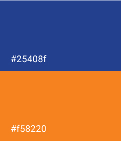
B&A WILL MAKE CUSTOMERS TRUST THEMSELVES AND BE CONFIDENT
Dark blue symbolizes trust, loyalty, wisdom, confidence, intelligence, faith, truth, and heaven.
B&A ALWAYS ENCOURAGE CUSTOMERS AND HOPE THEIR HAPPINESS
Orange combines the energy of red and the happiness of yellow. Orange represents enthusiasm, fascination, happiness, creativity, determination, attraction, success, encouragement, and stimulation.
Staircase
BELIEVE YOURSELF AS A FIRST STEP,
B&A WILL HELP YOU TO STEP UP TO GET TO YOUR GOAL
Based on interview insight, our target audience don’t know how to start and they are worried to start the new thing. B&A encourge them to believe themselves and it’s an important first step. B&A is always there with customers to help them not to give up during training period and help them to step up to their goal.