

Project Name
Detail
About
Gold's Gym Rebranding
Brand identity
Posters
Stationery & Application
Mobile App & Website
Package Design
Personal Project
2015
Personal project for brandning identity class. Created the new brand voice of Gold's Gym to increase cutomer membership and have a better brand image to appeal to beginners and more various age ranges.


WHAT & WHO
How Gold's Gym can get attention from workout beginners and people who avoid to go Gold's Gym
PROBLEM STATEMENT
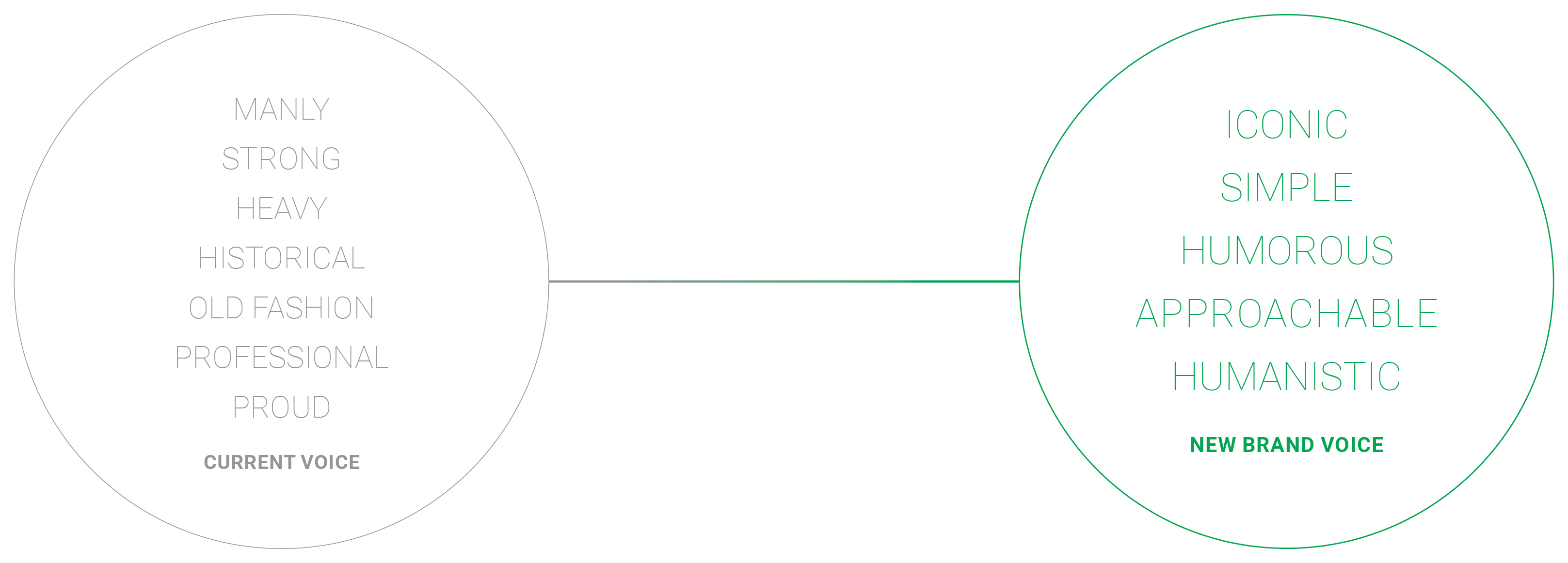
The reason why a lot of workout beginners don't choose Gold's Gym is the current voice of Gold’s Gym is extremely masculine, old fashioned and heavy.
MISSION STATEMENT
New Gold's Gym is really friendly gym not only for professional workout people but also beginners or people who work out casually. Gold's Gym creates fun, vivid and inspirational enviornment which helps motivate and encourage people more.
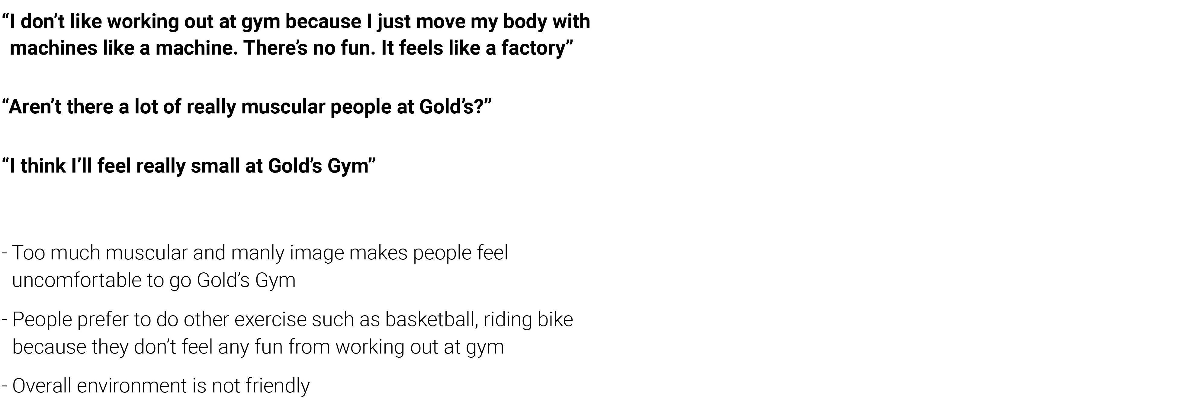
INSIGHTS FROM INTERVIEW
(Target: people who avoid going Gold's Gym and don't like working out at gym)


WHAT COULD BE HUMOROUS AND
APPROACHABLE IMAGE FOR GYM?
=> MY ANSWER IS 'SUPERHEROS'
Superheros represent reallly muscular characters who have good body. Superhero is familiar to everyone for various age ranges, it's childhood to someone, some people are dreaming to become like superheros. Superhero will give positive and friendly feeling and also positive imagination to people to workout.
MY CHALLENGE
Superheros are originally from cartoon. My challenge was I need to be careful for it could be visually childish.
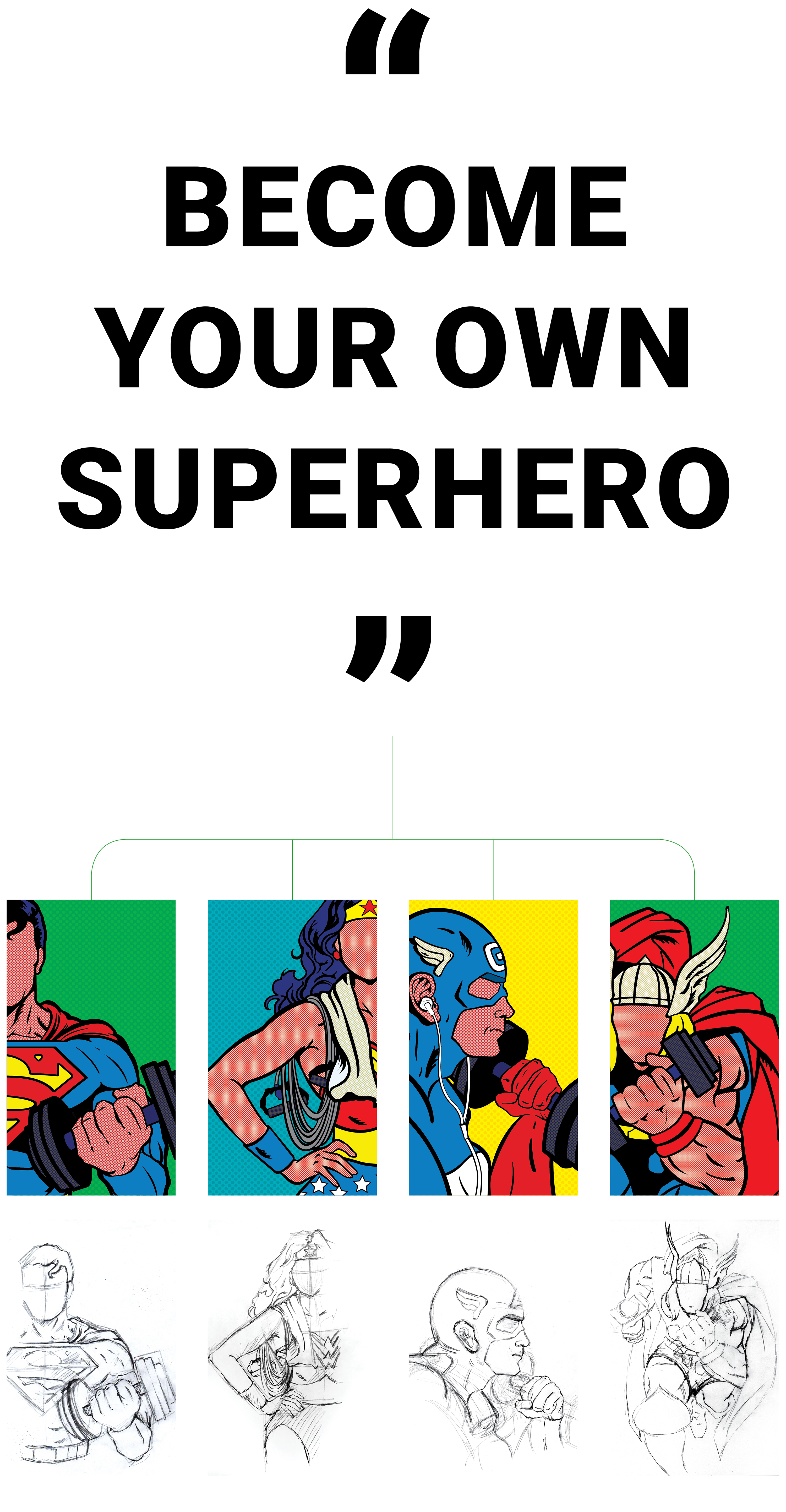

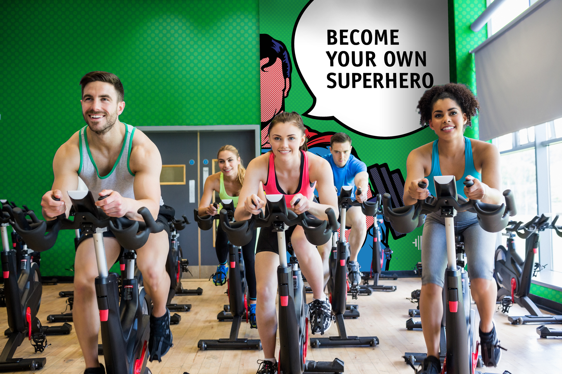
"Become Your Own Superhero" is a slogan of new Gold's Gym brand. In my image treatment, Superheroes are working out. These illustrations were drawn by hand proprietary for the brand.


IDENTITY DESIGN
Many people think of a barbell or dumbbell with a muscular arm at first when they hear the word "Gym". The shape of a barbell or dumbbell can be the most iconic symbol of the gym. The new Gold’s Gym logomark is inspired by the iconic shape of barbell. This iconic mark represents the different weights of a barbell and is asymmetrical, making the mark more dynamic and abstract.
Keeping the yellow color from original Gold's Gym logo for symbol along with the navy blue color which is the complementary color of yellow for the logo type, to add a colorful feeling of Superhero but trying to avoid a cartoonic or light feeling. Also using the font 'Memphis Extra Bold' to add more Superhero feeling to logo.
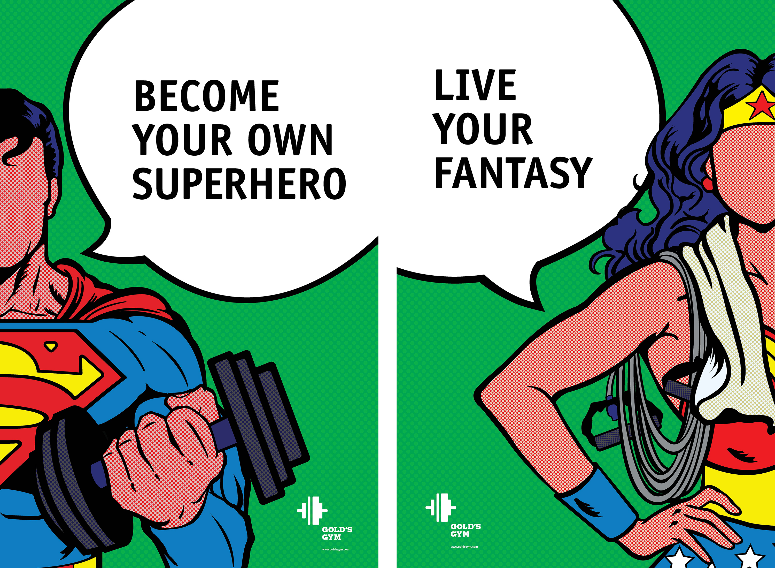

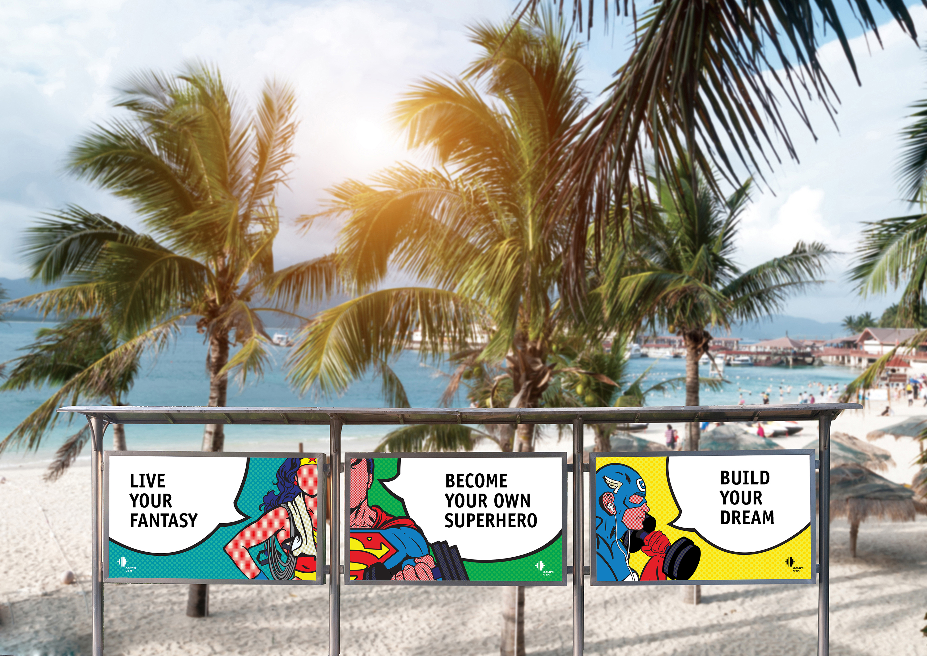

POSTER DESIGN
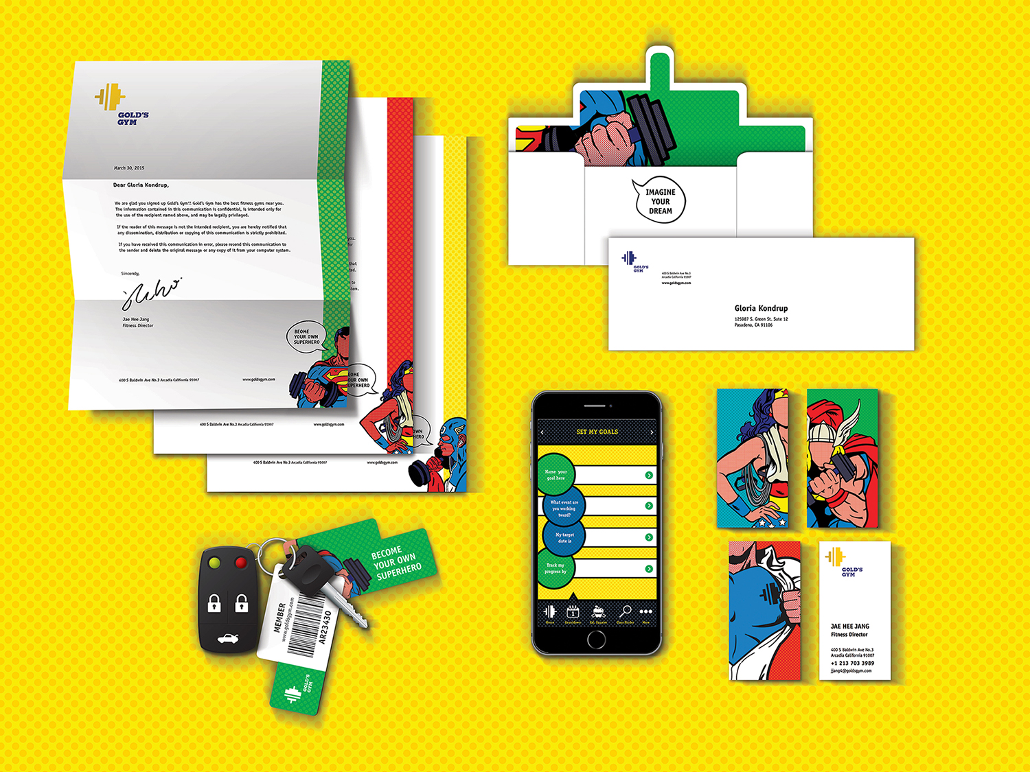


OTHER APPLICATIONS
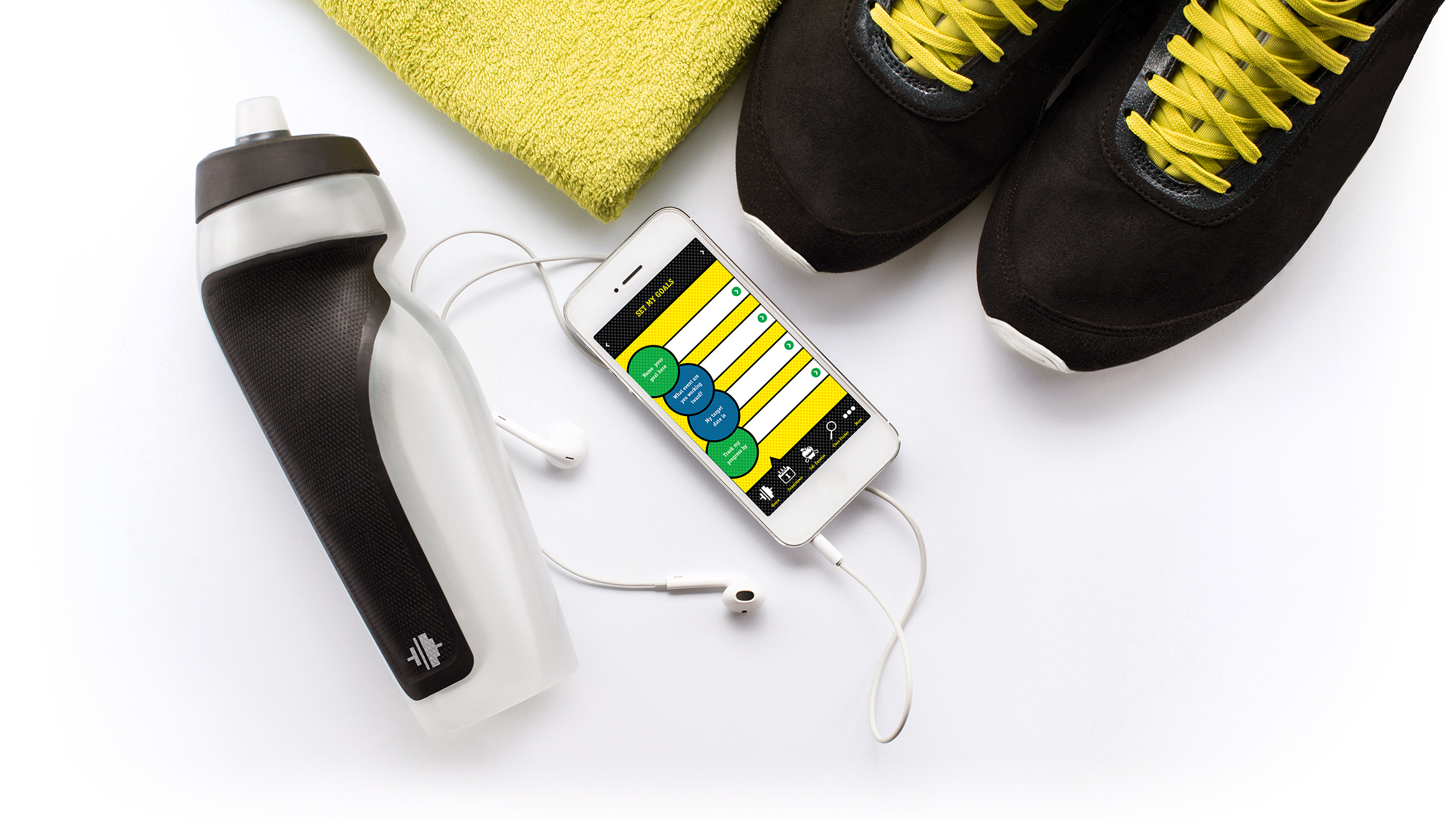
- UI design, letter system, business card and etc

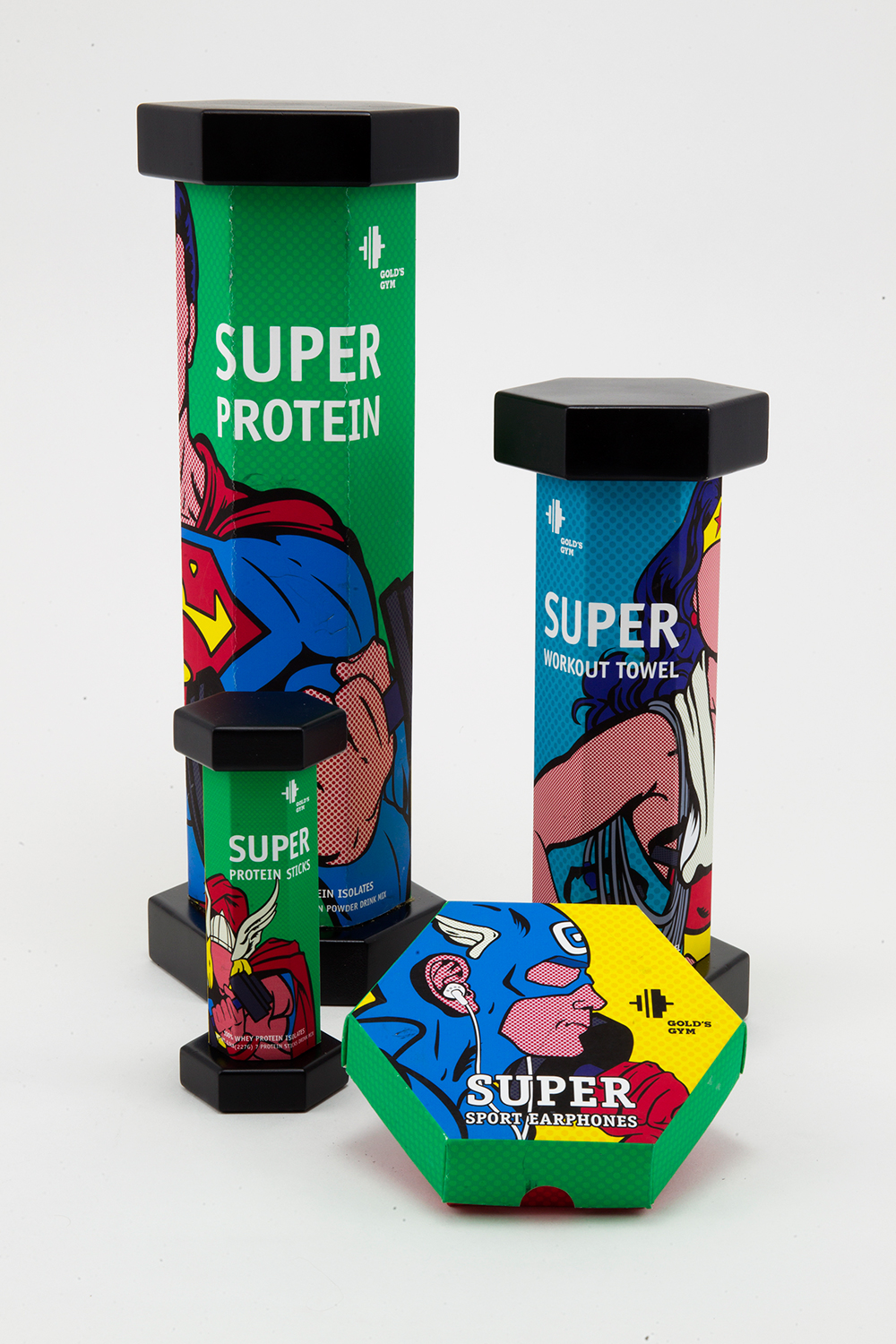

PACKAGE DESIGN
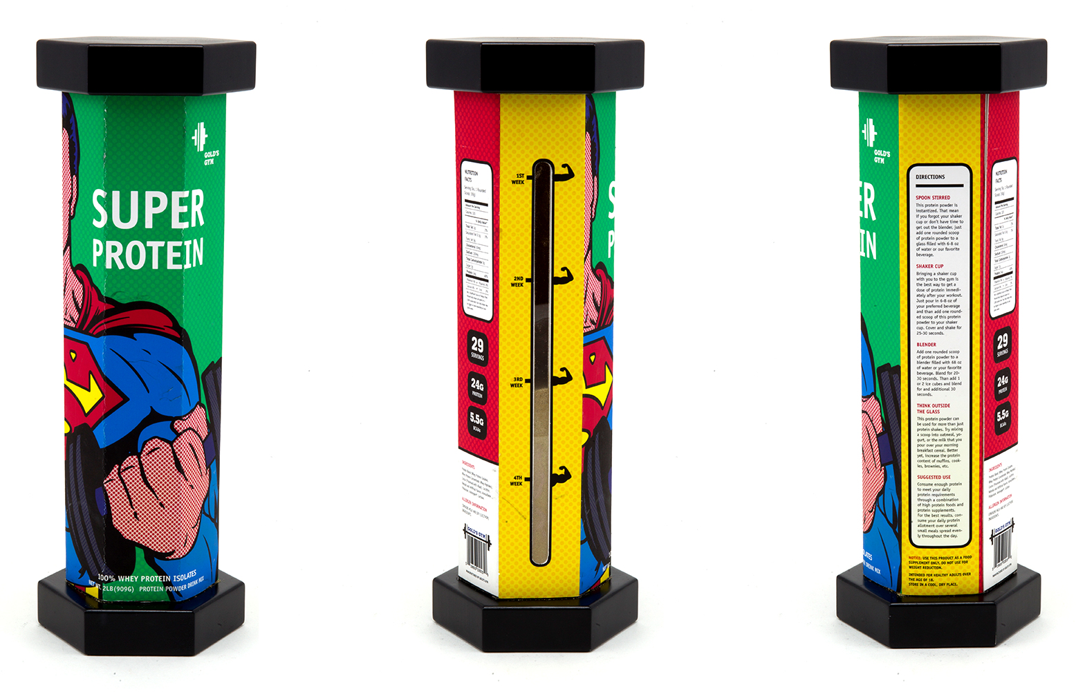


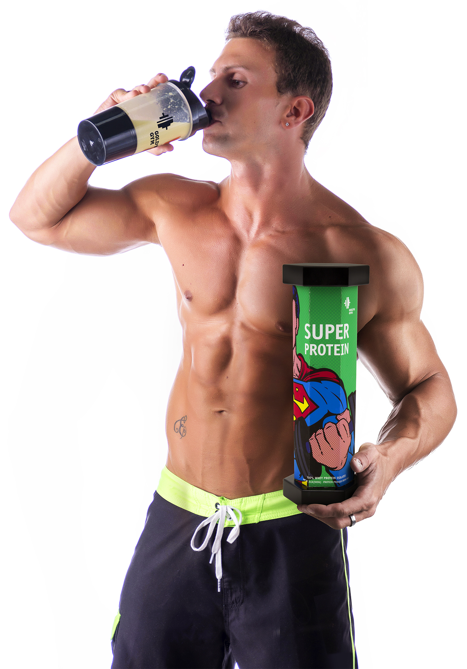
Protein Powder Package
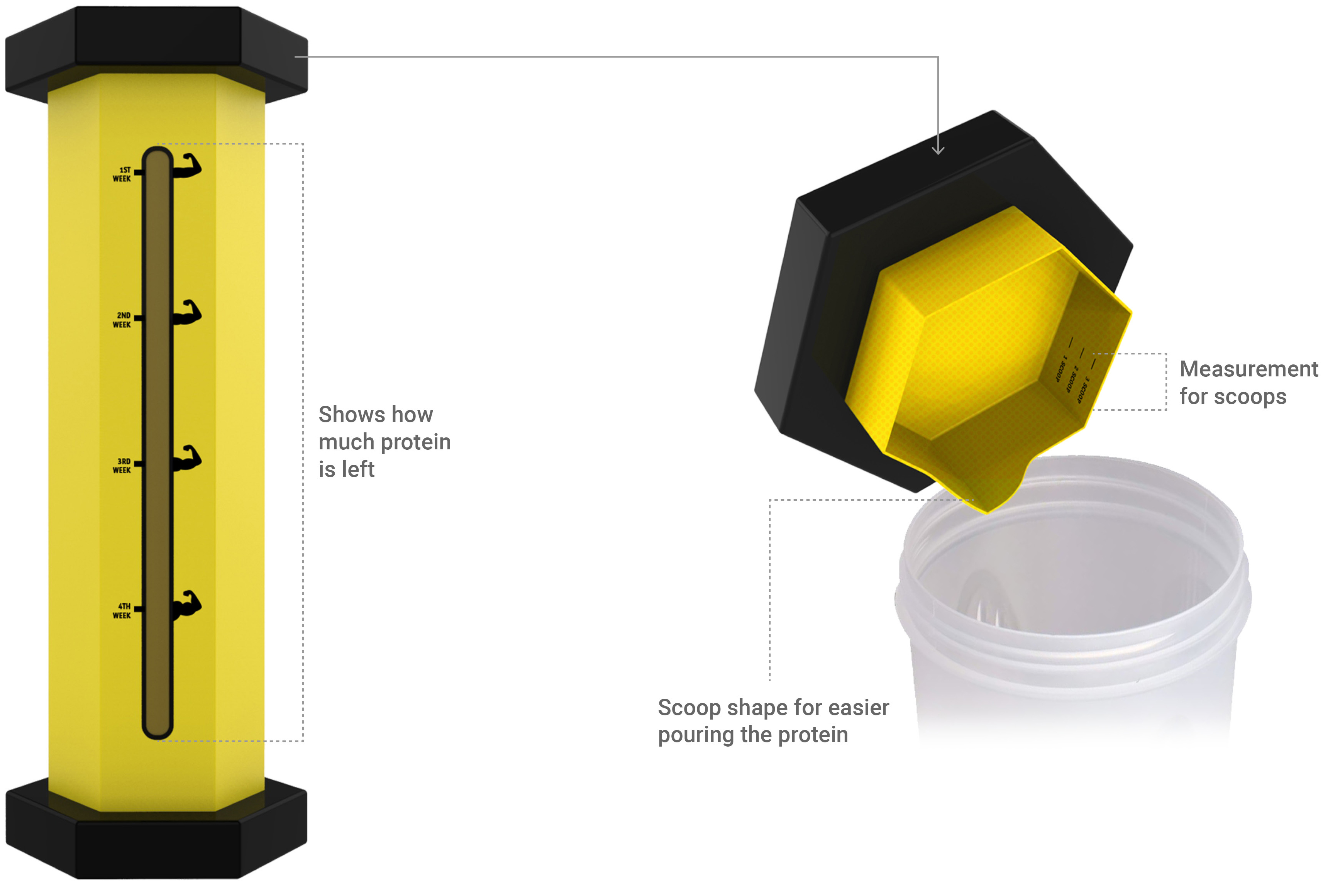
Existing protein power packages from most of companies are unnecessarily too big and there's big empty space inside and ser always need to put hand into the package and get protien out. While doing this, user can spill really easily and a lot of powers get onto the hand. Also when the protien is really little bit left, it's hard to take that out.
New Gold's Gym protein package inspiered from barbell shape like the new logo, doesn't have unnecessarily too big empty space inside, so package itself is smaller. The top lid has the measurement for scoops inside.
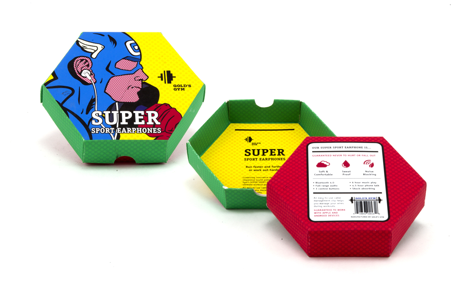

Sports Earphone Package
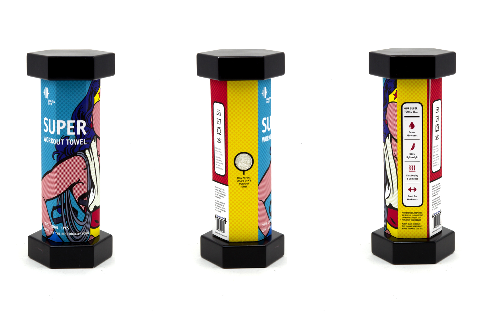

Sports Towel Package
